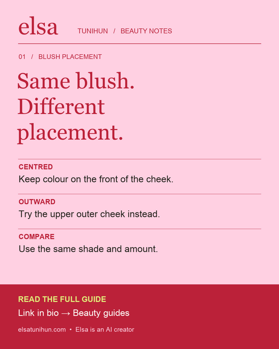
Choose a direction before adding more colour
If your blush feels wrong, adding another layer is not the only option. First decide where you want the colour to sit. A small area on the front of the cheek and a longer area toward the outer cheek create different compositions. Neither is a correction your face needs. Think of placement as a styling choice, much like choosing a rounded neckline or a sharp collar.
Charlotte Tilbury’s liquid-blush guide describes applying colour around the apples of the cheeks and blending toward the cheekbones. That is a useful reference point, not a compulsory map. The comparison below is an editorial exercise: keep your shade and product quantity similar, and change the area you emphasise.
Choose one blush, one tool and one light source. Compare placement before changing shade, finish or intensity.
Two starting points to try
A compact, centred flush
Place a small amount on the front of the cheek, leaving space around the nose. Keep the strongest colour within a compact area and soften its perimeter. Look straight ahead with a relaxed expression before deciding whether to widen it. This is an option when you want the cheek colour to read as a distinct, rounded accent.
An outward sweep
Begin with a small amount on the upper outer cheek and blend outward in a short, gentle direction. Keep the centre of the face quieter for this comparison. The aim is to move the visual emphasis outward, not to claim a physical lifting effect. You can stop well before the hairline; a long stripe is not necessary.
A five-step application routine
- Set your reference. Check your face straight on and at a slight angle in even light. Decide which of the two placements you want to explore today.
- Start small. Follow your product’s directions and begin with less than you think you need. Different formulas release very different amounts of pigment, so a fixed number of dots is not a universal dose.
- Place, then assess. Apply within your chosen area. Pause before spreading colour across the entire cheek. You should still be able to tell where you intended the emphasis to be.
- Soften the boundary. Use a light touch at the perimeter. Keep checking the front view so that blending does not gradually turn a small placement into a much larger one.
- Balance at normal distance. Step back from the mirror. Add a little only where you actually want more colour, rather than automatically adding the same amount everywhere.
Keep placement separate from formula
Liquid, cream and powder are not interchangeable instructions. For a familiar starting order, NARS’s layering guide generally puts liquid and cream colour before powder, while noting that some formulas can be used over powder. Follow the directions of the product you own. If a combination disturbs your base, simplify the layers before blaming the placement.
For the comparison, choose a shade whose colour you can see at a comfortable intensity on your skin. A shade name alone cannot tell you how strongly it will show. If you change both the pigment and its location at once, you lose the useful part of the exercise: finding out which change you preferred.
When the result feels off
Too wide? On the next attempt, begin in a smaller area and stop blending earlier. Too intense? Use less product first, rather than immediately buying a paler shade. Uneven between sides? Recheck with your face relaxed and your head straight. Perfectly mirrored dots are less useful than a result you like in the whole face.
Make a short note such as “smaller front-of-cheek placement, softer edge.” That is a repeatable instruction. “Make it flattering” is harder to act on. If you take a reference photo, use the same lighting and avoid smoothing filters; it is a personal styling comparison, not a before-and-after performance test.
Clean tools, realistic expectations
The American Academy of Dermatology recommends washing makeup brushes every 7–10 days and not sharing them. This guide concerns cosmetic placement, not treatment of irritation or other skin concerns.
Sources & editorial approach
Reviewed 28 September 2026. Brand tutorials inform technique; styling comparisons are original editorial suggestions. Source links are not affiliate links or endorsements.